The Overlooked Power of Colour in Office Design
The colours in your office influence focus, creativity, and even stress levels. This guide explores the science behind colour psychology, practical tips for workspace design, and how small changes can boost productivity and employee wellbeing.
Have you ever walked into an office and felt instantly energised or, conversely, oddly stressed? It’s no coincidence. The colours used in a workspace influence everything from mood to productivity, yet they’re often treated as an afterthought in design.
Research in colour psychology has shown that hues can impact focus, creativity, and even stress levels. For businesses, this means that thoughtful colour choices can make a tangible difference in how employees perform and feel. In an era where employee wellbeing and engagement are directly tied to business success, overlooking colour is a missed opportunity.
In this article, we’ll explore the science behind colour in the workplace, how it shapes behaviour and performance, and actionable tips for incorporating it into your office design.
The Science Behind Colours in Workspaces
Every colour triggers specific emotional and cognitive responses. Here’s how key colours can be strategically used in office design:
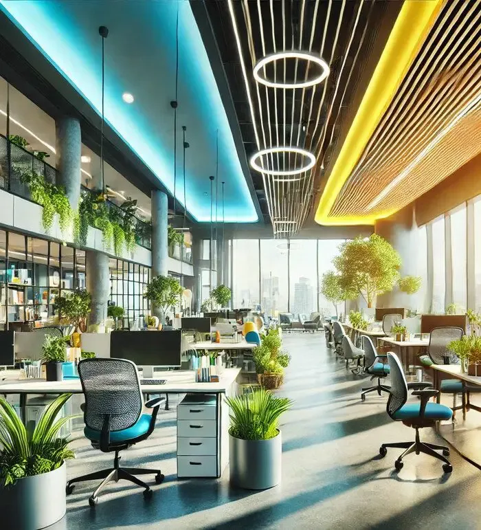
- Blue - For Calm and Focus: Known for its soothing properties, blue is often associated with trust, reliability, and calmness. It’s ideal for areas where deep concentration is required, such as individual workstations or conference rooms. Studies have shown that blue can lower heart rates and reduce anxiety, creating a sense of mental clarity. A tech startup might use navy blue in its coding rooms to help developers focus on problem-solving tasks.
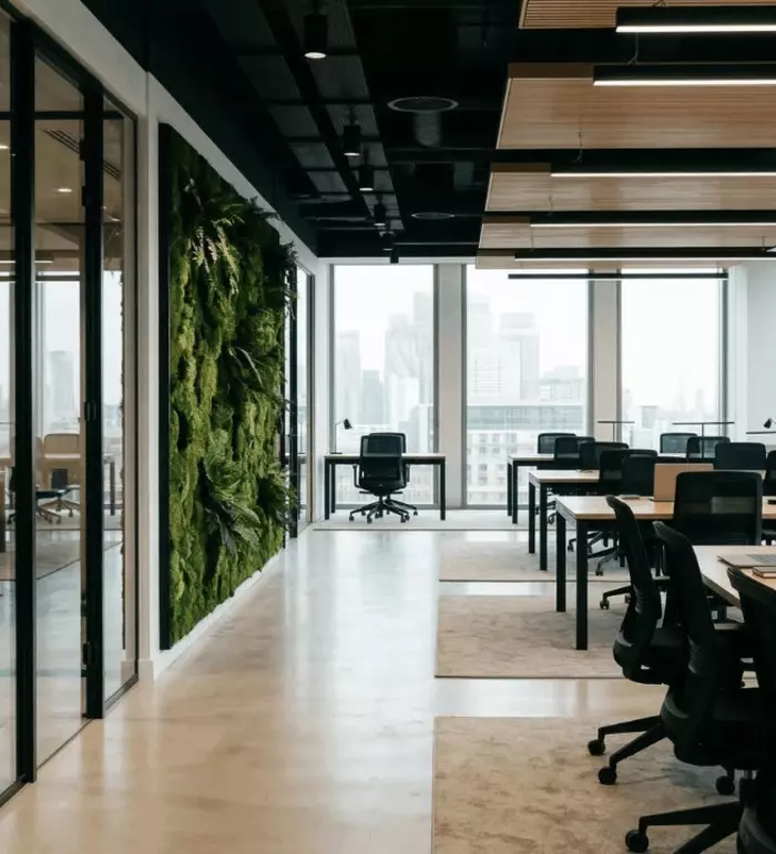
- Green - For Relaxation and Renewal: Green connects us to nature, promoting balance and harmony. This makes it a popular choice for break rooms or wellness zones where employees need to recharge. Research from the University of Exeter found that offices with natural green elements (such as plants or green walls) can boost productivity by up to 15%. A corporate office might integrate moss walls or soft green tones in its relaxation lounges.
- Yellow - For Creativity and Optimism: Yellow stimulates mental activity and inspires optimism, making it a great choice for spaces dedicated to brainstorming or innovation. However, its high-energy nature means it should be balanced with neutrals to avoid overstimulation. A marketing agency could use yellow accent furniture in its collaboration areas to energise team discussions.
- Red - For Energy and Action: Red is bold and commanding, evoking passion and urgency. While it’s effective in high-energy zones like sales floors, it should be used sparingly as too much can feel overwhelming. A sales department might include red wall accents to motivate goal-driven employees.
Ready to Transform Your Workspace? Get actionable insights and expert strategies in our free whitepaper. Transform your workspace into a hub of productivity and wellbeing. Download our whitepaper today.
How to Apply Colours Across Different Workspace Zones
To fully harness the power of colour, it’s essential to align your choices with the purpose of each workspace.
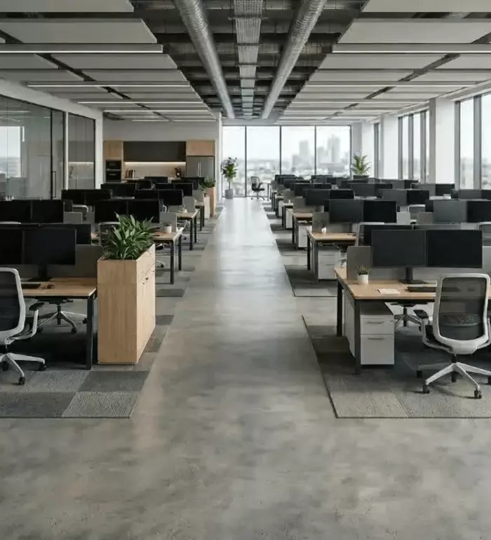
- Workstations and Private Offices: Focus on colours that minimise stress and enhance concentration. Cool tones like blue and grey are excellent here, as they create a calm, distraction-free environment. Consider adding green elements, such as plants, to provide visual relief and promote a sense of wellbeing. Tip: Use softer shades like pastel blues or light greys to prevent the space from feeling too cold or sterile.
- Collaboration Areas: Collaboration thrives in environments that feel energising and inspiring. Warm, bright colours like yellow and orange can stimulate idea-sharing and creativity. Pair these with neutral tones to maintain balance. Tip: Paint one accent wall in a bold shade and keep the rest of the room in calming neutrals to avoid overstimulation.
- Break Rooms and Wellness Spaces: Break rooms are a retreat, so calming colours like pale green or soft blue work well. These shades help employees decompress and reset. Incorporating biophilic design elements, such as greenery or wood textures, enhances the effect.Tip: Use cushions or rugs in earthy tones to complement green walls and create a cosy atmosphere.
- Reception Areas and First Impressions: Reception areas should reflect your brand identity while making visitors feel welcome. Warm neutrals combined with pops of colour that align with your brand palette can create a polished and inviting first impression.Tip: Integrate your company’s brand colours subtly into the decor, such as in artwork or furniture accents.
Achieving Balance: The Role of Tonality in Office Design
While colours set the tone, tonality (the lightness or darkness of a colour) plays an equally important role in creating balance.
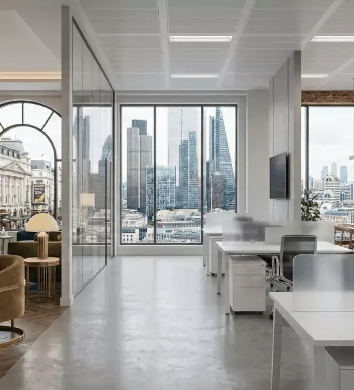
Light tones are an excellent choice for creating open and airy spaces. By reflecting more light, they make rooms feel larger and more inviting, which is especially beneficial for collaborative zones or smaller offices. These tones help foster an atmosphere of creativity and teamwork while ensuring the environment remains visually comfortable.
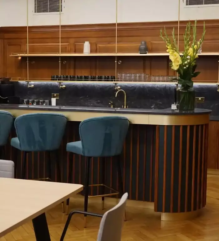
Dark tones, on the other hand, bring a sense of depth and sophistication to a workspace. They are particularly suited to executive offices or lounge areas where a more formal and intimate setting is desired. However, overusing dark shades can make spaces feel heavy or confined, so careful application is key to maintaining balance.
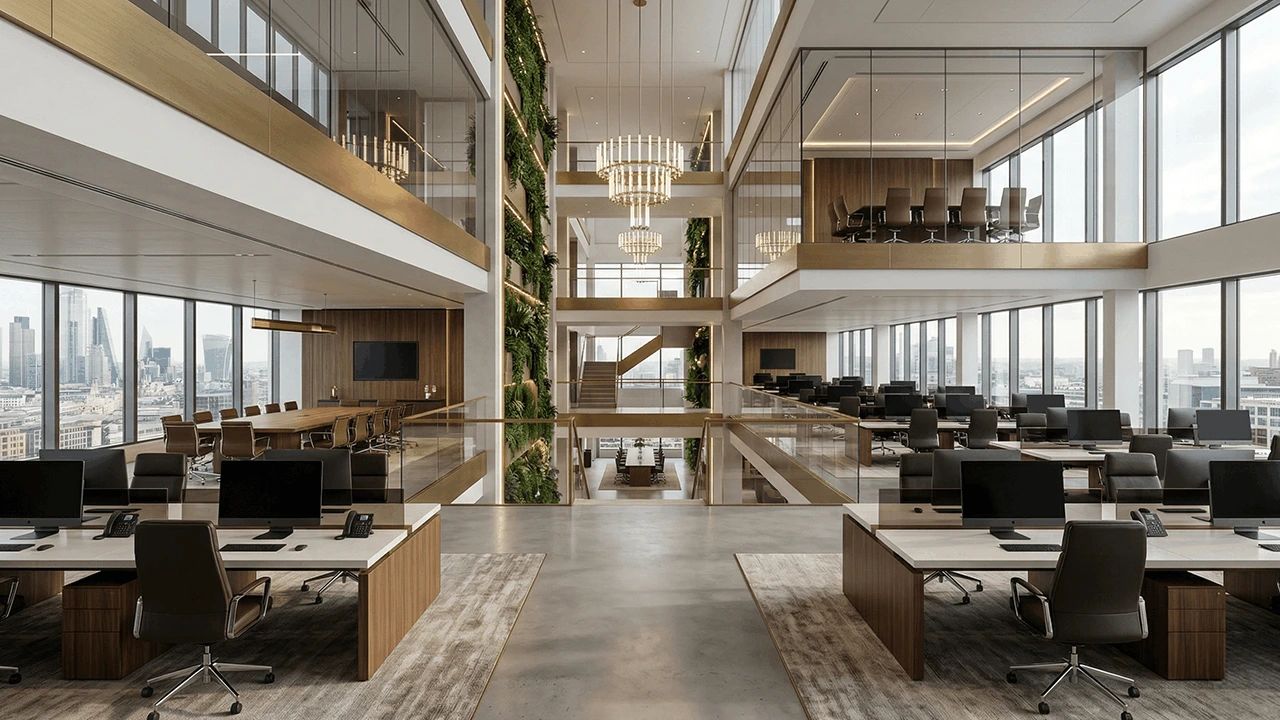
The most effective office designs strike a harmonious mix of light and dark tones. Combining a dark accent wall with lighter furniture and decor can create a visually engaging yet balanced environment. This approach ensures the workspace feels both dynamic and inviting without leaning too far in one direction.
Practical Colour Tips for Office Updates
If a full redesign isn’t feasible, small changes can still make a big impact:
- Feature Walls: Choose a single wall in a room to paint a bold colour that aligns with the room’s function (e.g., blue for focus zones, yellow for collaboration areas).
- Plants: Add greenery to introduce calming natural elements without committing to permanent changes.
- Accessories: Use cushions, rugs, or desk decor in energising or calming colours to subtly influence the atmosphere.
- Artwork: Hang paintings or prints with colour palettes that inspire creativity or focus.
Avoiding Common Colour Design Mistakes
Even with the best intentions, poor colour application can lead to issues:
- Too Much Vibrancy: Overusing bright colours like red or yellow can cause overstimulation, leading to discomfort. Keep these colours as accents.
- Ignoring Lighting: Colours look different under various lighting conditions. Always test how your chosen colours appear in natural and artificial light.
- Clashing with Branding: Ensure colours align with your organisation’s branding to maintain consistency and professionalism.
Why Colour Is a Crucial Element in Workplace Design
Colour impacts more than just aesthetics; it influences how employees feel, think, and perform. By aligning your colour choices with the purpose of each workspace, you can create an environment that promotes productivity, creativity, and wellbeing.
To learn more about how to use colour strategically in office design, download our free whitepaper copy and start transforming your workspace today.
